Northwest Mission of Hope: Logo Revamp
Northwest Mission of Hope is a non-profit medical organization comprised of volunteer workers from the United states and targeted countries that conducts medical missions to indigent populations here in the Pacific Northwest and to underserved areas in the Philippines and disaster stricken areas. As a collective, they work alongside local health agencies with the assistance of providing medical supplies and services.
Northwest Mission of Hope Logo Revamp
With this assignment, I was given the opportunity to do a revamp of The Northwest Mission of Hope logo that, while providing an updated look, still kept to the essence of their core purpose.
After speaking with them further about the project, I was able to gain context about the original design and what aspect of the logo in particular spoke to their identity.
Their original logo consists of the Caduceus within an arrow pointing in the upper left direction. But looking closer, the arrow symbolizes the Pacific Northwest with the colors resembling a flame, an icon of hope.
Skills: Logo design, Brand design, packaging and apparel design, Marketing Strategies
Tools used: Photoshop, Illustrator, Affinity Designer, Affinity Photo, Procreate
Moving forward, my goal was to create an improved logo that was clear, simple, and contained key elements of the original logo that were essential to their brand.
The Process
Going through my thought process and initial ideas, I found myself gravitating towards a design that utilized the arrow in a different perspective and intertwined around the staff with one of the snakes. To me, this would clarify their medical affiliation more clear while pay homage to their Pacific Northwest roots more prominently.
Though very messy, depicted is the best I could transfer my mental images onto physical concepts before developing vectors.
The Results
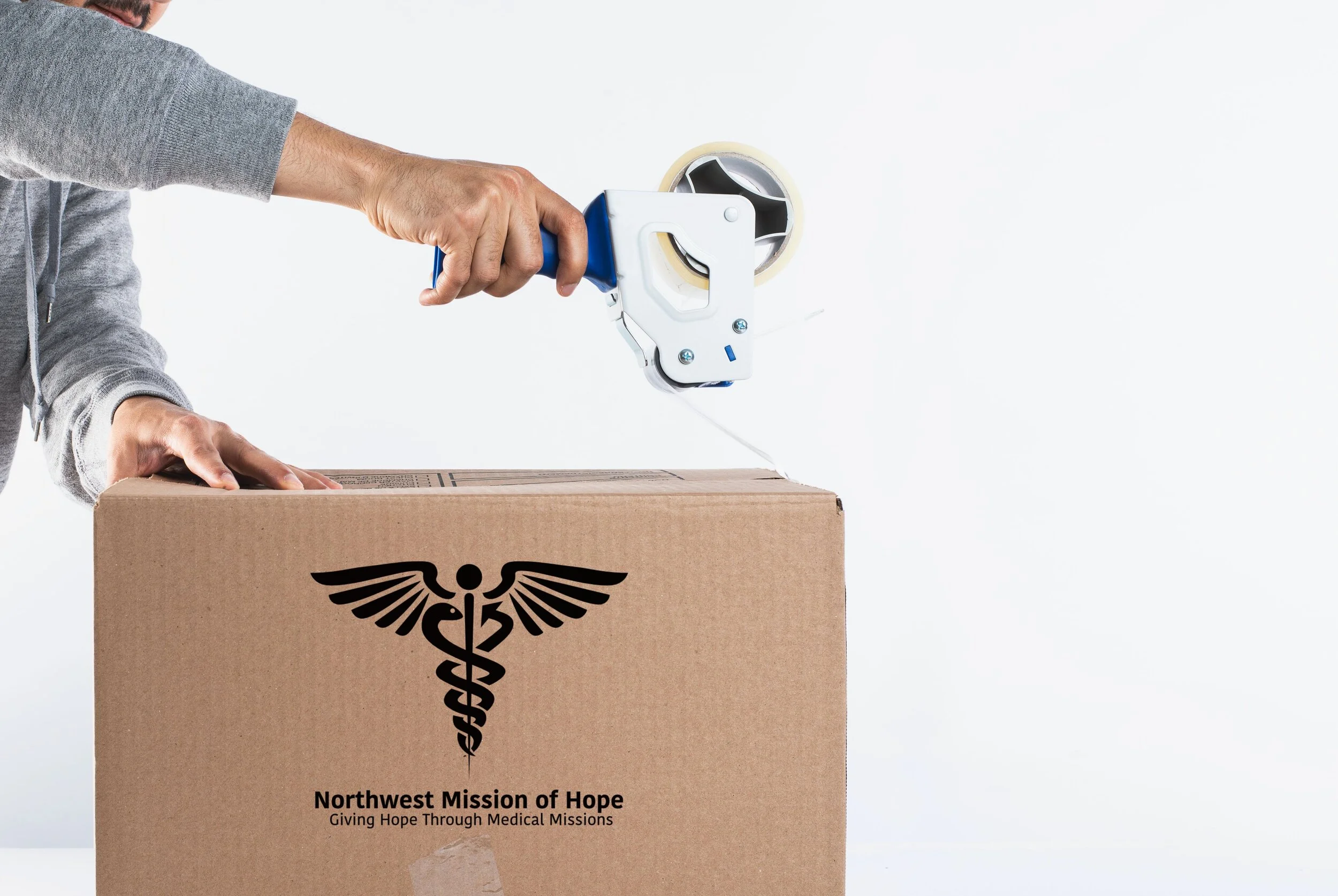
After working through the drafts and fine tuning the design, we were able to fully finalize a successful design!
What we found to be most beneficial was not necessarily doing a complete re-design, but more so re-organizing. By doing so, we were able to bring this logo to the next level. With this design, the hope is that they can use this logo to gain the eyes of the public and gain community interest so that their organization may be able to expand in numbers and serve more people.


